Glossary III

Glossary
  • Information Architecture
    • Information Architecture (IA) is the digital way of organization. Think of UX, the IA of a website influences the UX. IA is the arrangement of data in your website to make it easily accessible based on user tendencies or what a user is surfing to find.
  • Wireframe
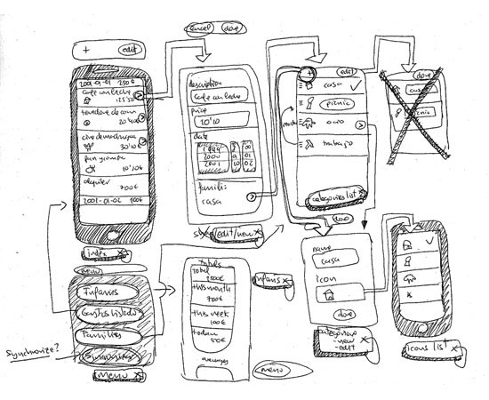
    • Similar to a blueprint, a Wireframe is a general layout of a webiste representing locations of objects and the website’s page structure. This frame suggests highlighted points of the page, definitions of specific information’s location, all in a conceptual manner.
  • Site Map
    • Site Maps can be helpfully described as a visual and broad depiction of breadcrumb navigation. Instead of an individual route that breadcrumbs display, sitemaps show the greater pathways a website builds to lead users in specific paths. It is very much like a hierarchy graph.
  • Web Page Header
    • If you have ever been on Google’s main website, you have seen one of the most iconic website headers of our time. The header is the branded “head” (or top) of a website, normally linking to the site’s home page. Every website has a header, be it large or small. There is probably a logo followed by trademarked text. Sometimes headers have navigations. However, the main commonality of headers is to largely represent the website itself.
  • Web Page Footer
    • Webpage footers generally are subliminal and blended into the website. Footers tend to be smaller than its counterpart the header. Some have information including links to a contact page, terms of use, FAQ, or maybe even copyright information.
  • Webfonts
    • The web is an ever changing place with new techniques and styles being uploaded and downloaded constantly. Likewise, typefaces and fonts are uploaded and downloaded in the hundred thousands if not more. But not every website and user can utilize each unique font or typeface as they are generally formatted for system use. Webfonts are standardized fonts installed within a browser. The browsers software includes compatible webfonts while removing mostly unused glyphs for universal use.
  • Creative Commons
    • The digital world is a huge front in the topic of piracy. Not oceanic piracy, but the use of stolen content and the user abuse of owner’s rights. Creative Commons is a firm helping bridge the gap between creators and users across the river of fair use. By offering different sets of use attributions, a creator can label their work with whichever user permissions Creative Commons offers and they prefer.
  • Skeumorphism
    • Skeumorphism is similar to augmented reality. Be it fake panelling to Apple’s Newsstand, skeumorphism is the design of a product to make it resemble what it is made to represent. Many aspects of Apple products are digitally-skeumorphed. Garageband is littered with tools that look like real life studio equipment, and the sounds created from it or even the shutter noise from photobooth are audio-skeumorphs. This design style provides users a familiar and easy-to-use website, app, or program.
  • Web-Safe Color
    • Webfonts are like the font versions of Web-Safe Color[s]. With billions of colors, easily designed sites will use colors consistently compatible with most browsers and systems. There are 216 colors, however, these colors are not constraining web design and more colors may be used.
  • UI Design Patterns
    • Many websites have similar functions when regarding simple user interaction. Login screens, shopping carts, and TOS agreement pages all generally follow the same rules. Thus, UI Design Patterns are followed to create an easy and understood process for the said and many other functions or services.

Critical Analysis III

analysis

“Creativity at its core is the art of generating ideas”

Successful and professional creative design is a process. As a designer, knowing what you are getting into is the right start. You need to establish a firm and contracted plan with a client to assure all minds start in the right place so everyone finishes in the right place as well. This is important, because first impressions are crucial in professionalism. The same page is the right page. “Conduct interviews with your client,” says howdesign’s Kvisockyogrady, “Conduct interviews with people outside of the organization.” A perfect segue to step two.

Now that you know what the job entails, the next professional thing to do is to find out your approach. After finding out what needs to be done, it would be silly to not find out how to do it. Otherwise a designer will be blindly shooting. Research what points are important for your client and what ideas you have to help their vision. Gather all the information you can before you trim the fat.

Not every idea is perfect. Knowing everything a designer possibly could for a client helps he or she eliminate information unecessary to complete the task at hand. Also, the designer can go back to step 2, and find out what may have slipped through the cracks. This is also apart of the next step. It is always good to reread essays. Just like it is always good to make sure your design process results in a smooth flowing product.

Repeating the last two steps as much as one can assures a good final result.  One can’t run a cold engine and keep it healthy. Professional design requires a rinse and repeat method, communication and execution. Have your peers review the product. Review the product yourself. Check corners you struggle with and do not leave a stone unturned. By now, the clients ideas with your creativity should mesh into a well designed product. When you are sure what you designed is just right for the client first and yourself second, the design process worked as it should.